iQura
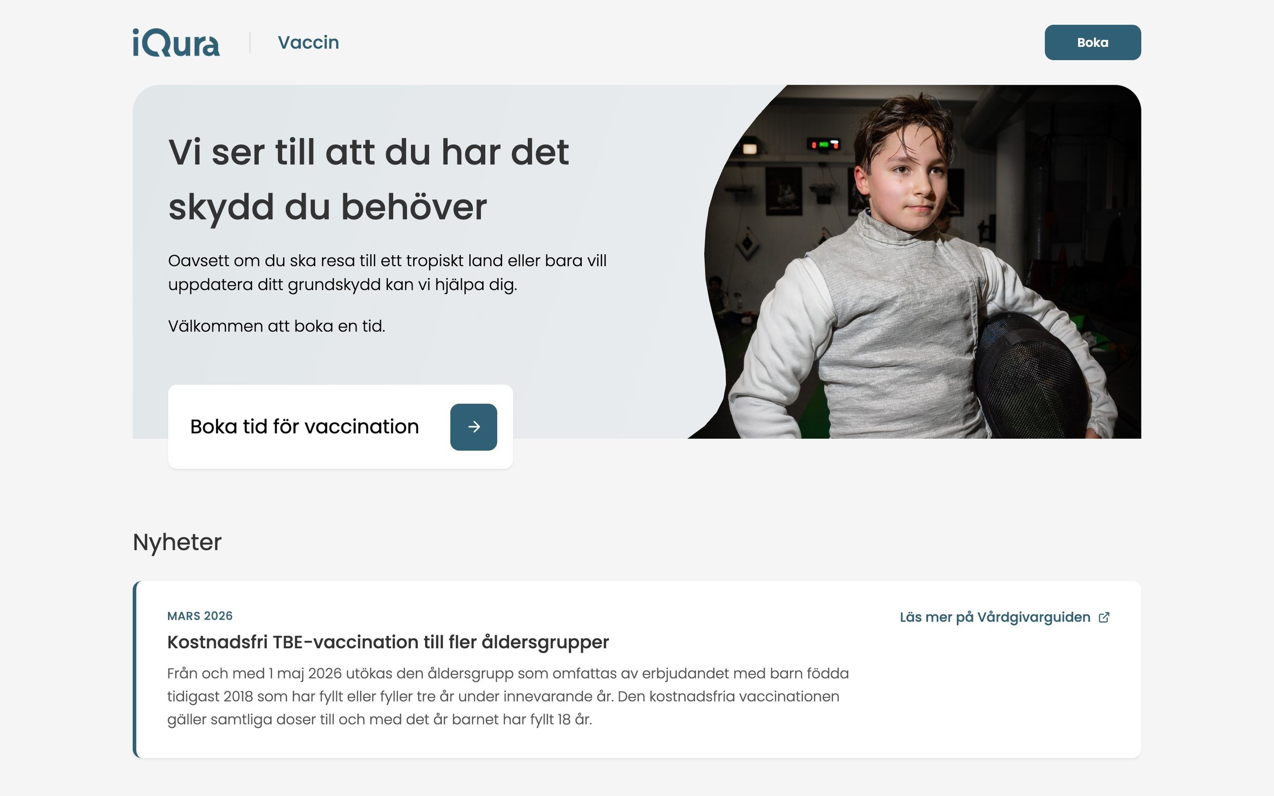
iQura runs a primary care centre and a vaccination clinic, each with its own website and patients who arrive with a problem, not a service name. I designed and built one multi-tenant site platform for all of their brands, with interactive blocks that lead from a need to a booking.
- Role
- Product design · Front-end · CMS
- Platforms
- Web · Mobile web · CMS
- Team
- Designed and built by me, for the client's team
- Made at
- Techtify AB · for iQura
- Disciplines
- Product design · UI/UX · Front-end
- Online
- iqura.se iquravaccin.se
Context
iQura has several brands, a primary care centre and a vaccination clinic among them, and each needs its own site. Building them separately means three times the work and three different patient experiences.
Who it's for
Patients looking for care or a vaccine, often on their phone, and the staff who edit the sites.
Constraints
- 01Several domains, one codebase. Each brand needs its own logo, colours, contact details and opening hours.
- 02Staff must be able to change content without a developer.
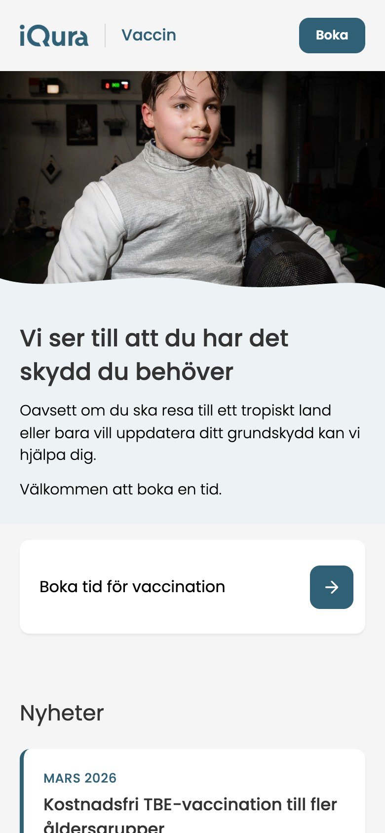
- 03Most patients arrive on a phone, often worried, and need to find the right care fast.
My role
I designed and built the website platform, from the tenant setup and the block library to the page designs.
- Multi-tenant setup: the domain decides the brand, content and theme
- About 25 custom content blocks, from price lists to opening hours
- Service and vaccine explorers, with booking always one step away
- Site settings per tenant that staff can edit in the CMS
Key decisions
The calls that shaped it
One platform, one setting per brand
- Problem
- Each brand needs to look like itself, but a separate site per brand would drift apart fast.
- Decision
- The domain decides the tenant. Each tenant has its own pages, posts, media and forms, and a Site Config in the CMS for name, logo, accent colour, navigation, contact details, opening hours and footer. Every page is built from the same block library. A tenant switch in the URL lets staff preview any brand from one place.
- Why
- Brand differences live in settings, not in code. Staff edit their own site, a new brand is a new tenant rather than a new project, and patients get the same patterns wherever they land.
Start from the need, end at a booking
- Problem
- Patients come with a problem like allergies or trouble breathing. A grid of service cards makes them translate that into the clinic's vocabulary, and the booking button ends up far away.
- Decision
- The service selector shows needs as pills: Allergi, Andningsbesvär, Diabetes and more. Choosing one fades in a short answer next to a green card that asks the question back ("Har du andningsbesvär?") with Boka tid. The vaccine explorer does the same with categories and vaccines, and shows the dosage, the price per dose and a link to 1177 up front.
- Why
- One answer at a time is easier to read than a wall of cards, and the next step is always next to it. On a phone the pills scroll sideways, and the vaccine list fades at the edge to show there's more. Each vaccine category has its own link, so staff can point patients straight to it.
Responsive
Two brands, one platform
The primary care centre and the vaccination clinic run on the same multi-tenant CMS, each with its own content, theme and domain.
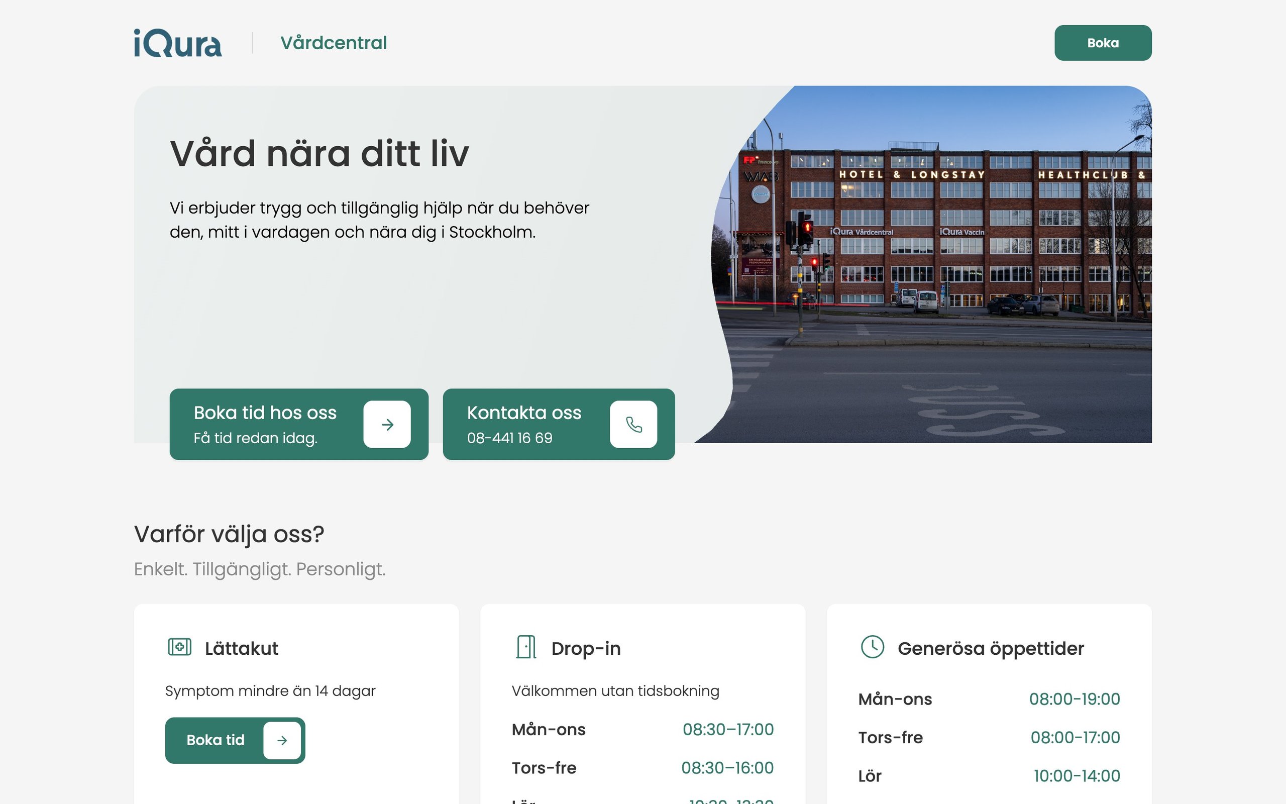
iqura.se: the primary care centre, starting from what you need. · 1440 px
Design system
The system
Calm healthcare green on light grey, with white cards and light-weight icons. Tenant colours are CSS variables, so each brand can adjust them.
Poppins
Everything, light to medium weights
- Tenant tokens set per brand, plus an accent colour per tenant in the CMS
- White cards with a 10 px radius and a soft shadow
- Font Awesome light icons for needs and vaccines
Outcome
Where it landed
The platform runs iQura's brands from one codebase, live at iqura.se and iquravaccin.se, and staff edit their own content in the CMS.