Nim: The Far World
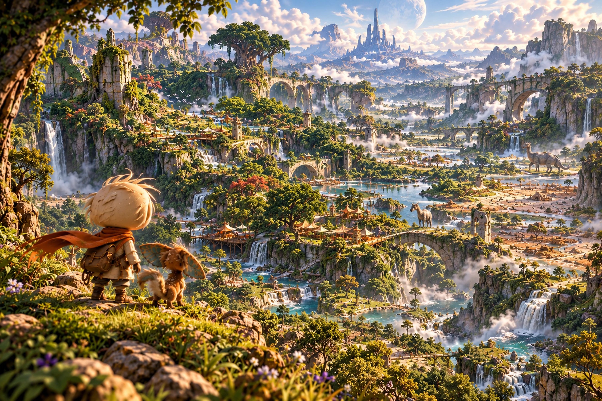
Most games for children either talk down to them or lean on combat. Nim is a semi-open-world adventure about curiosity: a small explorer and a strange companion, Pip, in a world older than they are. I'm making it alone: I set the creative and art direction, wrote the rules the art is judged against, build it, and run the reviews that decide what's good enough.
- Role
- Game design · Creative and art direction · Build
- Platforms
- macOS · Windows
- Team
- Solo: one person, no team
- Made at
- Techtify Labs · in-house product
- Disciplines
- Game design · Creative direction · Art direction · Unity · Blender
Context
One person making a game that has to look premium. The easy path is art that's "good for a solo project": generated textures, asset-store trees, a default Unity look. The game's world has to make a child want to walk towards what they see, and that's exactly what generic art fails at.
Who it's for
Children around 6 to 12, without talking down to them, and the older players and adults who play alongside them.
Constraints
- 01Combat is not a core loop. The game has to hold attention through exploration, traversal, light puzzles and relationships.
- 02Failure means retry or a different outcome, almost never "quest failed".
- 03Concept images are AI-generated direction frames. They communicate a direction; they are not canon or final art.
- 04Performance is part of art direction: around 60 fps on a Mac, with nothing platform-specific.
My role
Nim is a one-person project: I design it, direct it and build it in Unity and Blender. I wrote the World Bible (what the world is) and the Visual World Bible and Art Quality Directive (how it should look and how we judge it). I review every visual milestone against them and give the verdict.
- World, characters and tone: Nim, Pip, Home and six regions
- Visual language: shape, colour, light, materials, UI
- Direction frames and the notes on what each one locks
- The quality gate and milestone reviews
- Playtests for movement, Pip and the narrative systems
Key decisions
The calls that shaped it
"Implemented" is not "approved"
- Problem
- When a pipeline works, it's tempting to call the result done and move on. The first art pass for Home ran end to end: generated textures, scripted rocks, crossed-card trees. On screen it looked like what it was.
- Decision
- Every visual checkpoint gets one of three verdicts: APPROVED, ITERATE, or REJECT / CHANGE APPROACH. Each is judged against fixed tests: the screenshot test (would we put it on the store page?), the noise test (strip particles and post-processing, does it still work?), and the five- and fifty-metre tests. The first pass was rejected for final quality: no procedural-noise materials, no scripted rocks, no card trees. It moved to restyled scanned materials and modelled grass, and flagged hero trees, sculpted rocks and the characters as work for specialists.
- Why
- The bar is absolute, not relative to it being a one-person project. A written gate turns "it looks fine" into a decision with a reason, and it says out loud where the current method can't reach the bar instead of quietly shipping something weaker.
The world guides, not arrows
- Problem
- Games for children often hold their hand with glowing trails, quest markers and highlighted objects. It works, but it teaches players to follow the marker instead of looking at the world.
- Decision
- Guidance comes from the world itself: light, contrast, path width, water, landmarks, sound and framing. No glowing trails, objective pillars or painted arrows, unless a future accessibility setting needs them. Curiosity is always rewarded, though not always with an item: a view, a creature's behaviour, a shortcut, a new understanding. The UI is a sketchbook journal in Nim's own hand.
- Why
- The core promise is a world that makes you say "I want to go there", then "what is that?". Children are good at noticing things when the world gives them a reason to. Keeping the UI quiet keeps the world in charge.
Gallery
Direction first
Direction frames set the bar every pass is measured against. The 3D models and in-engine art are still far from that bar, so they stay off this page until they earn it. The game is a work in progress.
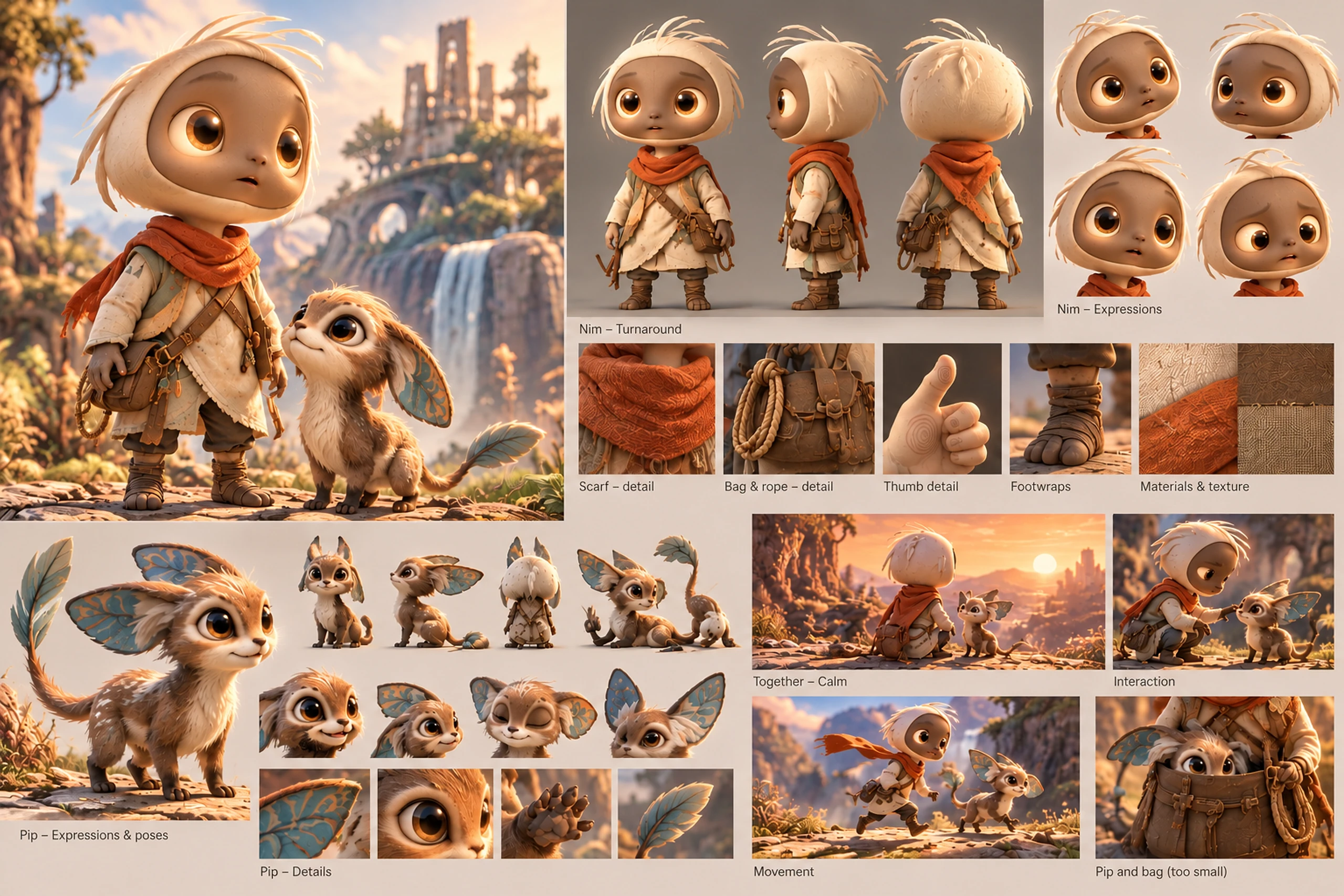
Nim and Pip: the direction frame every pass is measured against (AI-generated)
Tools
Built with
Unity
Engine: Unity 6.3 with URP, the game, its systems and the journal UI
Blender
Characters and props, built from Python scripts and look-dev renders
Design system
The system
Natural base, selective unusual accent. Stone, soil, wood, vegetation and water stay muted, so a few teal, amber, violet and rust accents carry weight. Regions differ, but they're never colour-coded like game levels. These hexes are representative values I picked from the direction frames and look-dev, not engine tokens.
Patrick Hand
The sketchbook journal, written as Nim
- Stylised form, believable material: stone should feel like stone
- Strong silhouettes over surface noise; Nim must read at 5, 10 and 20 metres and in greyscale
- Four approval levels: Exploration, Direction, Approved Design, Production Final
- UI is tactile, simple, quiet and warm, never futuristic or holographic
“It should simply communicate: "This is beautiful."”
— Art Quality Directive
Outcome
Where it landed
The first four milestones are done and playtested: Nim's movement and rope, Pip as a companion that feels alive, the narrative systems, and a greybox slice of Home. The art pass for Home is at its fifth review, graded ITERATE. The method holds up and runs at about 100 fps on a Mac, but Home doesn't feel cosy and enclosed yet. That's the next pass.