ChargeNet
For ChargeNet AB
EV drivers jump between operators, apps and price models just to charge their car. ChargeNet puts finding a charger, starting it and paying for it in one app, and plans the charging stops for longer trips. I designed the app and built its front-end, including the trip planner and the station map.
- Role
- Product design · Front-end
- Platforms
- iOS · Android
- Team
- Techtify: two people
- Made at
- Techtify AB · for ChargeNet AB, where Techtify held equity
- Disciplines
- Product design · UI/UX · Front-end · Brand
- Online
- chargenet.io
Context
Public charging is split across many operators, each with its own app, prices and map. Drivers have to work out where a free charger is, what it costs and whether they'll make it to the next one.
Who it's for
EV drivers in Sweden, both for everyday top-ups and longer road trips.
Constraints
- 01Stations come from many operators through e-roaming. Thousands of pins on a phone map have to stay readable and fast.
- 02The price model varies by station (per kWh, per minute). It has to be clear before charging starts.
- 03Drivers use the app next to the car, often in a hurry, and on the road between stops.
My role
I designed the app and built most of the front-end in React Native. I owned the trip planner and the station map, including station caching, clustering and the trip planner UX overhaul.
- Flow from home screen to finder to charging
- Trip planner, from first version to the 2026 overhaul
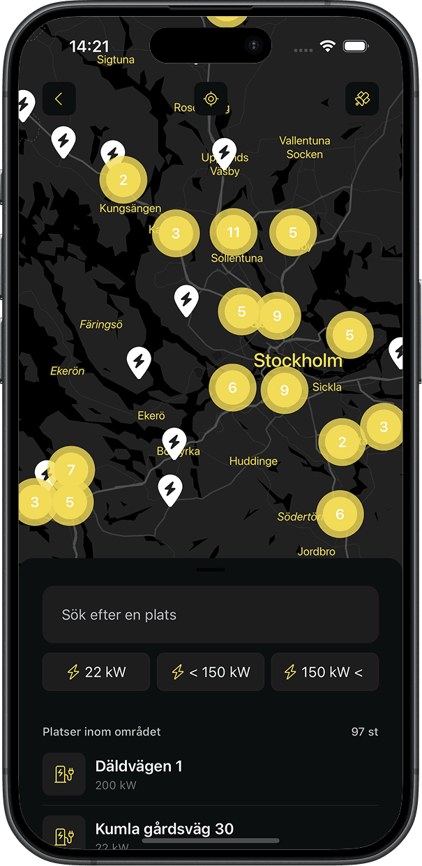
- Station map: grouping, clustering, filtering and operator logos
- Visual language: dark UI with one yellow for action
Key decisions
The calls that shaped it
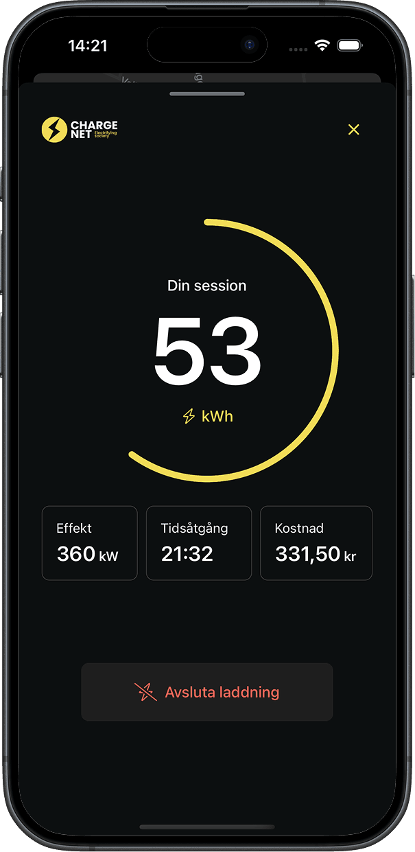
The charge button becomes the live session
- Problem
- Once charging starts, the main question is "how far along is it?". Hiding the answer one screen deep makes people dig for it.
- Decision
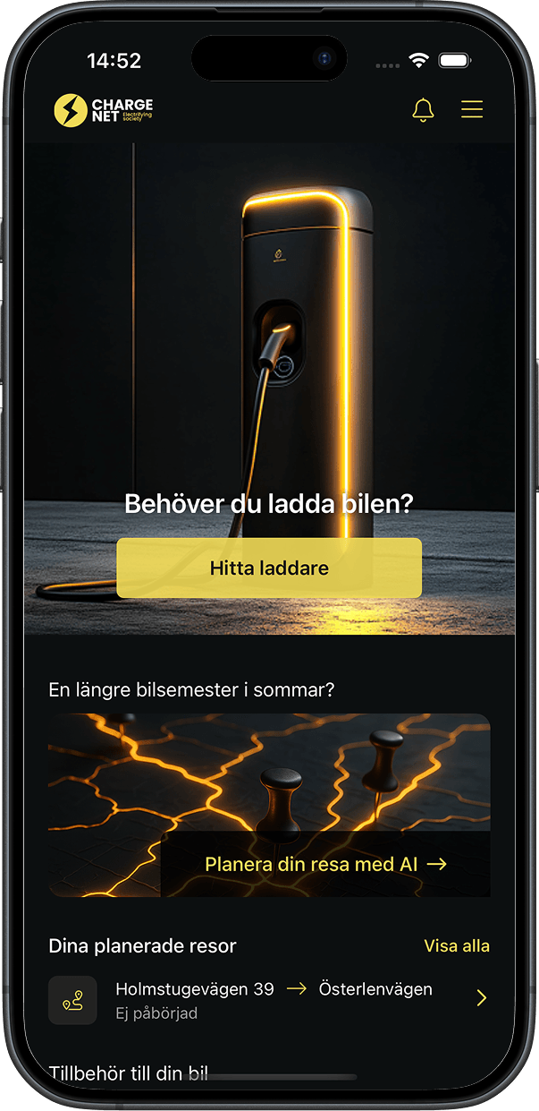
- The home screen has one yellow button: "Behöver du ladda bilen?" (Need to charge your car?). While a session runs, the same button turns into a full-width bar showing live kW, battery % and a running timer. Tapping it opens the session.
- Why
- One place answers both questions, where to charge and how it's going. The most important action never moves.
A trip planner that hands off to navigation
- Problem
- Planning a long trip meant guessing where to stop, and then switching between a map app and a charging app at every stop.
- Decision
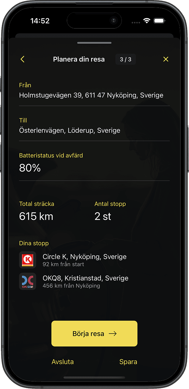
- You enter start, destination, the car's range and your battery % at departure. The planner returns the charging stops with the distance between them. On the road it shows "Stopp 1 av N" and opens the phone's own navigation for each stop. When you return to the app within 200 m of the station, it moves on to the next stop by itself.
- Why
- Drivers already trust their navigation app, so I didn't rebuild it. The planner only does the part that's unique to EVs, and the fewer taps needed beside the car, the better.
One pin per place, capped clusters
- Problem
- With roaming stations from many operators, the map turned into a blur of overlapping pins, with several chargers stacked on the same address.
- Decision
- Chargers at the same spot (to about ten metres) merge into one pin. The map then clusters on a grid that coarsens until no more than 60 items are drawn at once. Each station shows its operator's logo, and a max-kW filter hides chargers that are too slow.
- Why
- A map you can read beats a complete one. Operator logos let drivers spot networks they already know, and the stations are cached, so the map opens without a wait.
Flow
Find, charge, go
The whole charging loop in one dark, high-contrast app that's readable in a car at night.
Do you need to charge?
The home screen asks one question and answers it with one yellow button. Trips and shop sit below.
Every operator on one map
Chargers from many operators, clustered and filterable by power, so you stop switching between apps.
Pick a charger
A bottom sheet with the site, each charger's ID and power, and navigation, without leaving the map.
Price before you start
Price per kWh and per minute and the payment method are shown before the big Start button, never after.
The session, live
One big number for energy, with power, time and cost underneath, updated in real time.
Plan the trip
Set battery and destination and get the stops along the way, each handed to your navigation app.
On the web
Live on the web
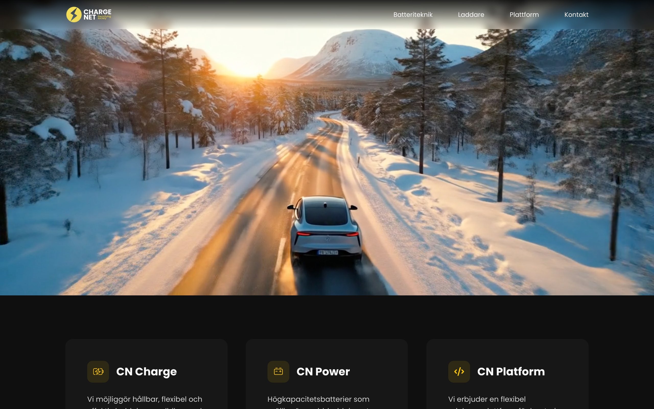
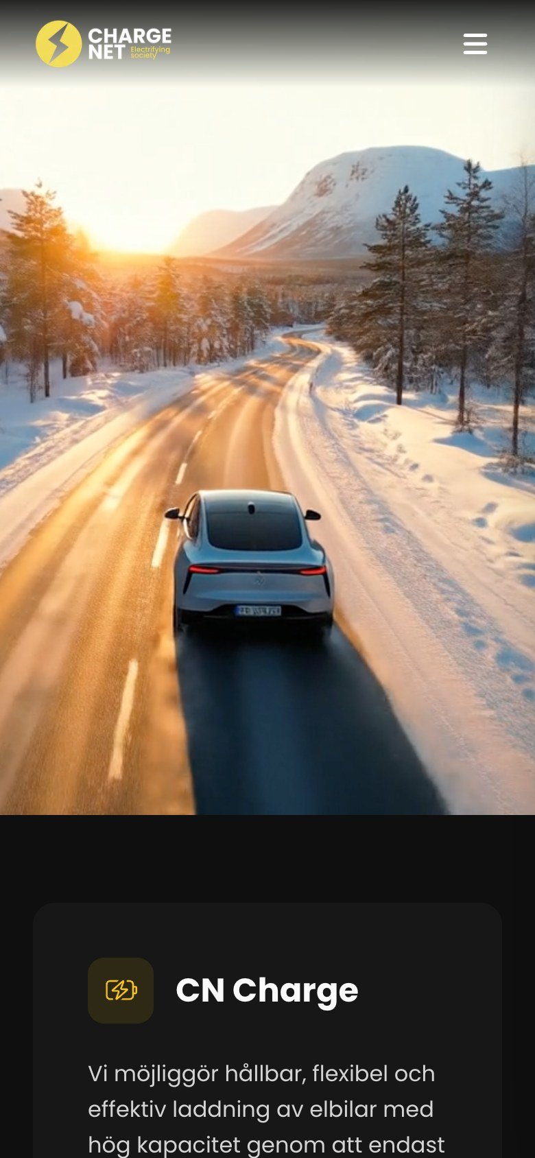
ChargeNet's public site, live today.
Visit chargenet.ioDesign system
The system
A near-black base for use in the car and at night, with one yellow that always means "charge".
System font (SF Pro / Roboto)
Everything
- Custom light and dark map styles
- Prices per kWh and per minute shown before you start
- Swedish and English
Outcome
Where it landed
The app covers the whole charging loop: find, start, follow, stop and get the receipt by email. It also has a small shop for home chargers and cables. In May 2026 I rebuilt the trip planner and the station map with caching and clustering.