Cheer Pressure
After depression treatment ends, the hard part starts at home, and a relapse can creep in before anyone notices. Cheer Pressure is a phone companion, Cheri, that compares you only with your own usual and speaks up when your days drift. We built it in a weekend at Junction 2026, and I designed the look and feel, Cheri's character, the phone flow, the film and the pitch deck.
- Role
- Design · Character · Phone flow · Film and deck
- Platforms
- iOS · Android · Web · macOS
- Team
- Three people: Dante Rohlin (software), Filip Landin (machine learning) and me (design)
- Made at
- Techtify Labs · in-house product
- Disciplines
- Product design · UI/UX · Character design · Motion · Brand
- Online
- Live demo
Context
The Aalto challenge was "Beyond the Clinic". People who finish TMS treatment for depression go home, and about half of those who respond lose the effect within a year. The clinic only sees them at check-ups, and the first signs show up in ordinary life: shorter nights, fewer steps, fewer people. Those signs are easy to miss from the inside.
Who it's for
Adults living at home after depression treatment, the people they trust, and, only if the person says yes, their clinic.
Constraints
- 01Health data about mental health: nothing measured may leave the phone, and nothing may sound like a diagnosis.
- 02The person may be low on energy when they open it. Every screen has to work with one look and one tap.
- 03A sensor can't know how someone feels. The product has to be honest about what it measures.
- 04A hackathon weekend: all code written at the event, a demo, a film of at most two minutes and a deck by Sunday morning.
My role
I owned how Cheer Pressure looks, sounds and behaves for the person using it. Dante Rohlin built the software, the desktop app and the messages service. Filip Landin built the machine-learning track: the research basis, the expression model and the local voice chain. I designed the companion, the screens and the flow through them, then made the film and the pitch deck.
- Look and feel: warm paper, near-black ink, one light serif for headlines, and the design tokens
- Cheri's character: three live 3D directions, then the final three.js companion with nine moods and three furs
- The phone flow: onboarding, Home, the daily hello and the steps after "Not my best"
- Wording: how a measurement becomes a calm sentence
- The film and the pitch deck
Key decisions
The calls that shaped it
A character, not a dashboard
- Problem
- A relapse-prevention tool can easily become a chart of your decline. Nobody wants to open that on a bad day, and a mascot that sulks when you've been away makes it worse.
- Decision
- I sketched three companions as live 3D models: Pebble (a soft creature), Glim (a calm light) and Sprout (a seedling). Each had the same eight states, from listening to "breathe with me". The final Cheri is a small round furred creature with nine moods. I held every direction to four rules: no guilt, calm by default, readable at 22 points in a menu bar, and slower, smaller motion when Reduce Motion is on.
- Why
- The person meets a calm presence, not a score. State shows in silhouette, eyes and posture, so it reads at every size. Cheri never looks sad because someone was away. Wanting attention is an invitation, and she drops it after a moment.
No scores, no diagnosis words, enforced by a test
- Problem
- A face model or a step count can't tell you how someone feels. A percentage or a "risk" label would claim more than we know, and it could frighten someone who is already struggling.
- Decision
- Anything from a sensor is worded as an observation against the person's own usual: "your nights have been shorter than your usual". Only the person's own answer ever says how they feel. The test run fails if risk, score, diagnosis words or percentages show up in the phone's phrases or in the clinic report. A second script catches outdated wording across the whole codebase.
- Why
- Wording rules in a doc get lost by Saturday night. A failing test doesn't. It also kept the pitch honest: we say it notices changes in behaviour, never that it detects depression.
One question per screen
- Problem
- Setup asks a lot: what helps you, what you noticed first last time, who you trust, what your clinic may see, which sensors are allowed. On one long form, people skip it or give up.
- Decision
- Onboarding asks one question per screen, with a progress bar, Back, and every step after the first skippable. Each permission gets its own screen and one plain sentence. The app works with any combination of yeses and nos. After setup there are only three places: Home, the conversation and Settings. One view at a time, no page scrolling, one primary action.
- Why
- Each answer feeds a later step. "What helps you?" becomes the first suggestion, "Who do you trust?" the second. Small questions make that easy to give. A script checks that every screen fits 390 × 844 without scrolling.
A help ladder the person built
- Problem
- When the numbers drift, the obvious move is to alert someone. But a phone that calls your clinic or your mother on its own takes away the person's control, and an alarm on every wobble trains people to ignore it.
- Decision
- Cheri measures quietly and asks only when at least two different categories (Sleep, Energy, Social, Mood) have changed. One category alone never asks. Then help comes one step at a time: first one small thing from the person's own list, two days later the offer to reach someone they trust, and after seven days the clinic, only if they agreed to that at the start. "Need help now?" is on every screen, and crisis words always show a fixed, pre-written help card.
- Why
- Most of the time the person can help themselves, and it should feel that way. The trusted person comes before the clinic because it's easier to text a friend than to call a care team. Every step is something the person agreed to in advance.
Character
Meet Cheri
This is the real character, running live: the same three.js model that ships in the app. Every state reads from silhouette, eyes and posture, so it works in a 22-point menu bar and at full size. Pick a mood or a fur.
CalmThe default. Most of the time Cheri just keeps you company.
Mood · cycling, pick one to stop
Fur
Nine moods, designed so that no state can read as disappointment in the person.
Flow
A phone that notices, then asks
Every screen fits a phone without scrolling, holds one question and has one primary action. "Need help now?" is always in the corner. All data shown is made up, and the app says so.
A tool, not a therapist
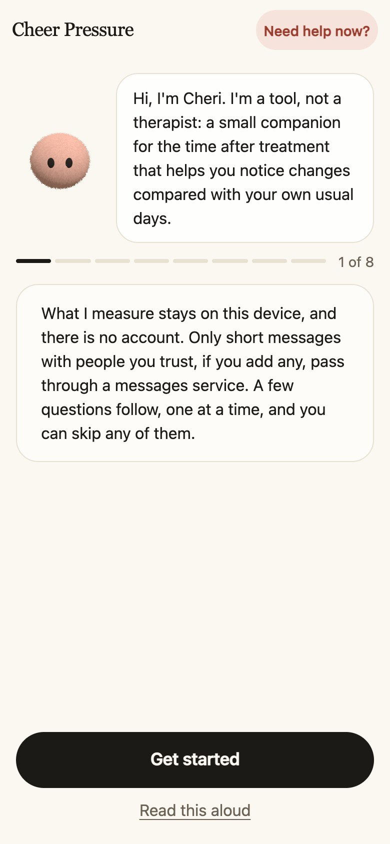
Onboarding says what Cheri is and isn't before asking anything, and every question can be skipped.
One calm line
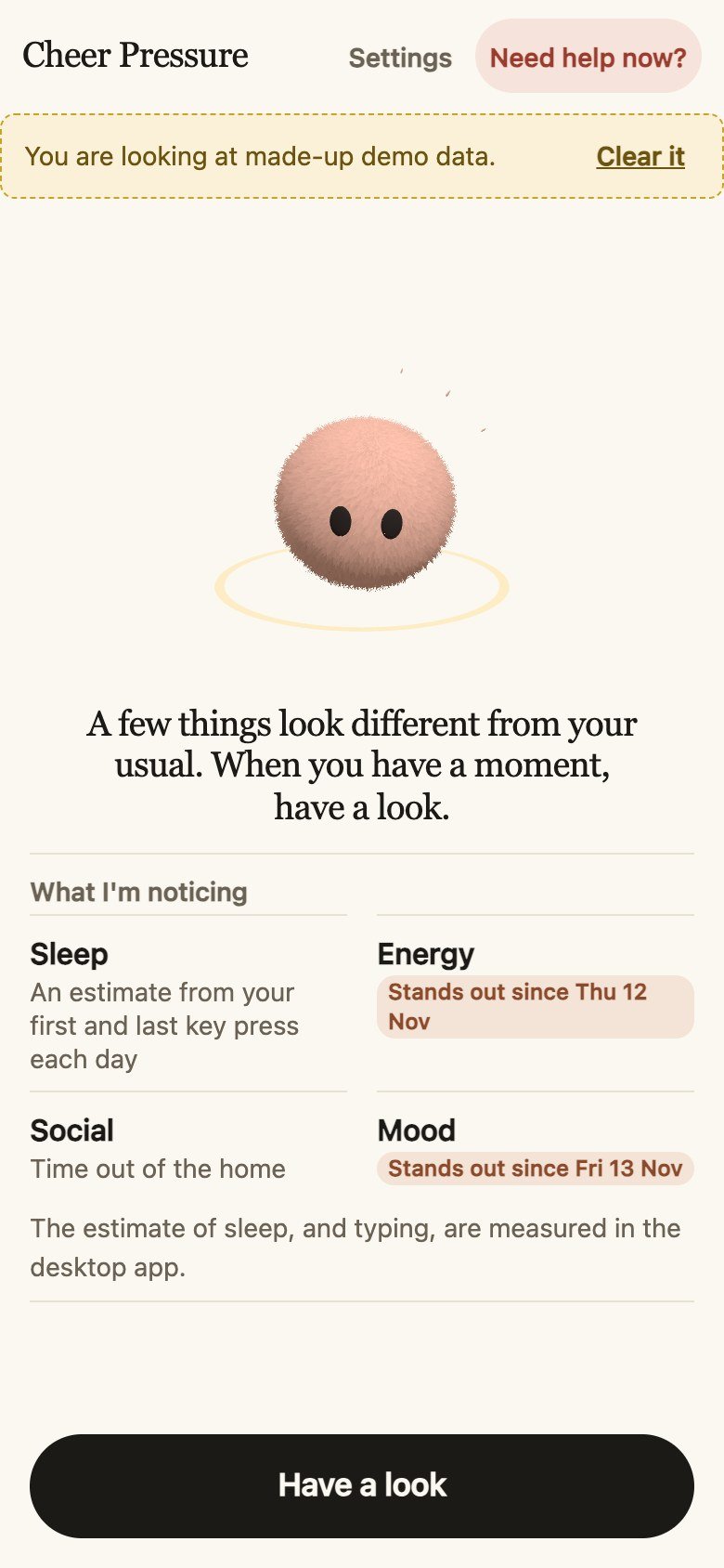
Home doesn't show scores. Cheri says a few things look different and lists them in plain words.
Asked, not alarmed
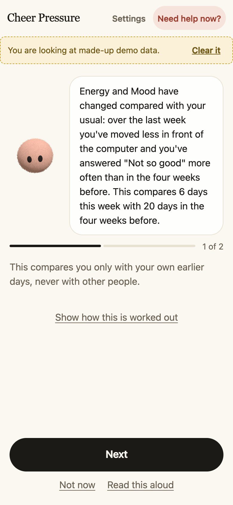
When two categories change, Cheri explains what she saw, compared only with your own usual, and asks one thing.
Your values, your range
Sleep, energy, social and mood, each against your own normal, never against other people.
Share with the clinic
Exactly what they would get, shown before anything is saved or printed. Nothing is sent from the app.
Gallery
Film and demo
I made the pitch film and the demo surfaces the judges used: a phone frame on a laptop and the clinic's view.
The pitch film
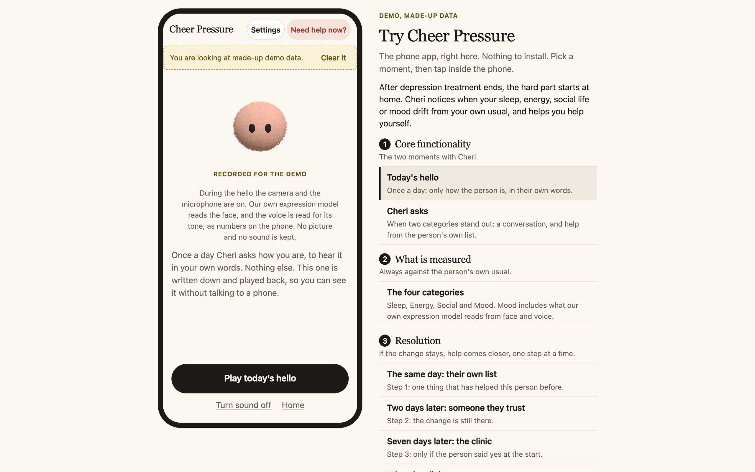
Demo mode: the phone flow inside a frame, with a moment picker
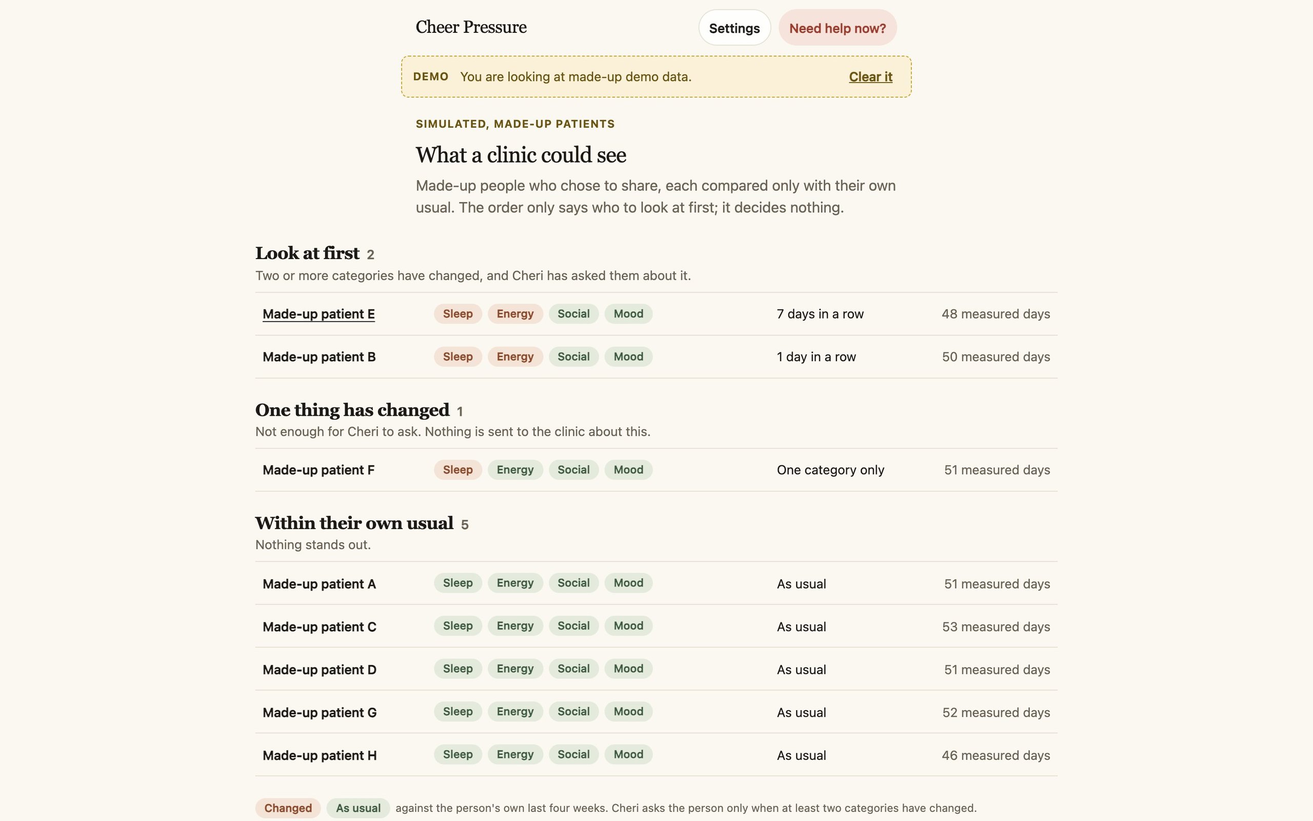
What the clinic sees, only when the person chooses to share
Design system
The system
Warm cream paper and near-black ink, so it feels like a notebook, not a medical app. One amber accent, and state colours that never shout.
System serif (New York / Georgia)
Headlines, light weight, never italic
System rounded (SF Pro Rounded)
Body and interface
- System fonts only, nothing loaded from elsewhere
- All text at 4.5:1 or better on the paper
- 48 px tap targets and one black pill for the one primary action
- Changed is dark clay, not red. A change is information, not an alarm
“Cheri is a tool, not a therapist or friend, and says so.”
— Settled decision in the team's project doc
Outcome
Where it landed
We submitted a working phone flow, a desktop companion, a browser demo with a made-up person and eight made-up weeks, a two-minute film and a deck. Every screen with made-up data says so. The research boundaries are written into the product: it notices changes against your own usual, and it never claims to detect or predict depression.