Patient inbox
For Nordiska Kliniken
Patients write to a plastic surgery clinic before and after surgery, and several nurses answer from one shared inbox. I designed the platform: the three-pane inbox, AI-drafted replies, the case context panel and, later, a reception inbox that sorts the clinic's general email. Niklas and Dante built it.
- Role
- Design lead · UX and UI
- Platforms
- Web (desktop)
- Team
- Techtify: I designed it; Niklas and Dante built it
- Made at
- Techtify Labs · for Nordiska Kliniken
- Disciplines
- Product design · UI/UX
Context
After surgery, patients write in with questions about swelling, wound care and pain. Several nurses share the work. Without one system, two people answer the same patient, or nobody does, and the context a nurse needs sits in the patient record, not next to the message.
Who it's for
Nurses and coordinators at a plastic surgery clinic, plus the surgeons they pull in. Later also receptionists, who handle the clinic's general email.
Constraints
- 01Healthcare: patient data stays inside the clinic's tools, and every reply is written or approved by a person.
- 02Many people work one queue at the same time, so ownership of a case has to be obvious.
- 03Swedish-language UI in the clinic's own typeface and warm colour palette.
My role
I led the product's UX and UI from the first concept through the production platform, including the reception inbox for the clinic's general email. Niklas and Dante built it.
- Information architecture: case list, conversation, context panel
- Interaction design for claiming a case, replying and handing over
- AI draft composer with a rich-text editor and signature
- Context panel: AI assistant, notes, patient record and internal chat with @mentions
- Reception inbox design: classification, spam view, read-only Gmail sync, a role for skin therapists
Key decisions
The calls that shaped it
Replying claims the case
- Problem
- In a shared inbox the worst outcome is two nurses answering the same worried patient, or each assuming the other one did.
- Decision
- Pressing Svara locks the case to you and moves it to Hanteras. Colleagues see a lock and who holds it, and the reply button is hidden for them. A lock left alone for 30 minutes is released and the case goes back to the queue.
- Why
- Ownership is taken at the moment of intent, not through a separate assign step people forget. The timeout makes sure a case is never stuck behind someone who got called away. The production app kept one owner per case and added a way to ask to take over.
The AI drafts, the nurse sends
- Problem
- Many questions have well-known answers, but a reply to a patient has to come from a person who has read it.
- Decision
- The AI draft only appears when a nurse chooses to reply. It opens in the normal rich-text composer, clearly labelled "AI-genererat svar", greeting and signature included. It is fully editable, can be discarded, and is never sent on its own.
- Why
- The draft saves typing without taking the decision away. Keeping it in the same composer means editing it feels like writing, not like approving a machine. The production app later started comparing each draft with the reply that was actually sent, so the team can see where drafts get changed.
When in doubt, it's not spam
- Problem
- The clinic's general inbox mixes patient questions, bookings, suppliers and spam. Receptionists also work in Gmail every day, and can't lose that while a new tool is tested.
- Decision
- Every mail gets three tags: type, area and city. Area routes skin-care mail to the skin therapists at the right clinic. Anything the classifier is unsure about goes to the inbox, not spam. Tag changes are saved as examples for the classifier, and a sender moved out of spam never lands there again. The Gmail sync is read-only, so reception keeps working as before.
- Why
- A real patient mail in spam is far worse than a spam mail in the inbox. Read-only first means the tool earns trust before it takes over anything.
Gallery
Three panes, one case at a time
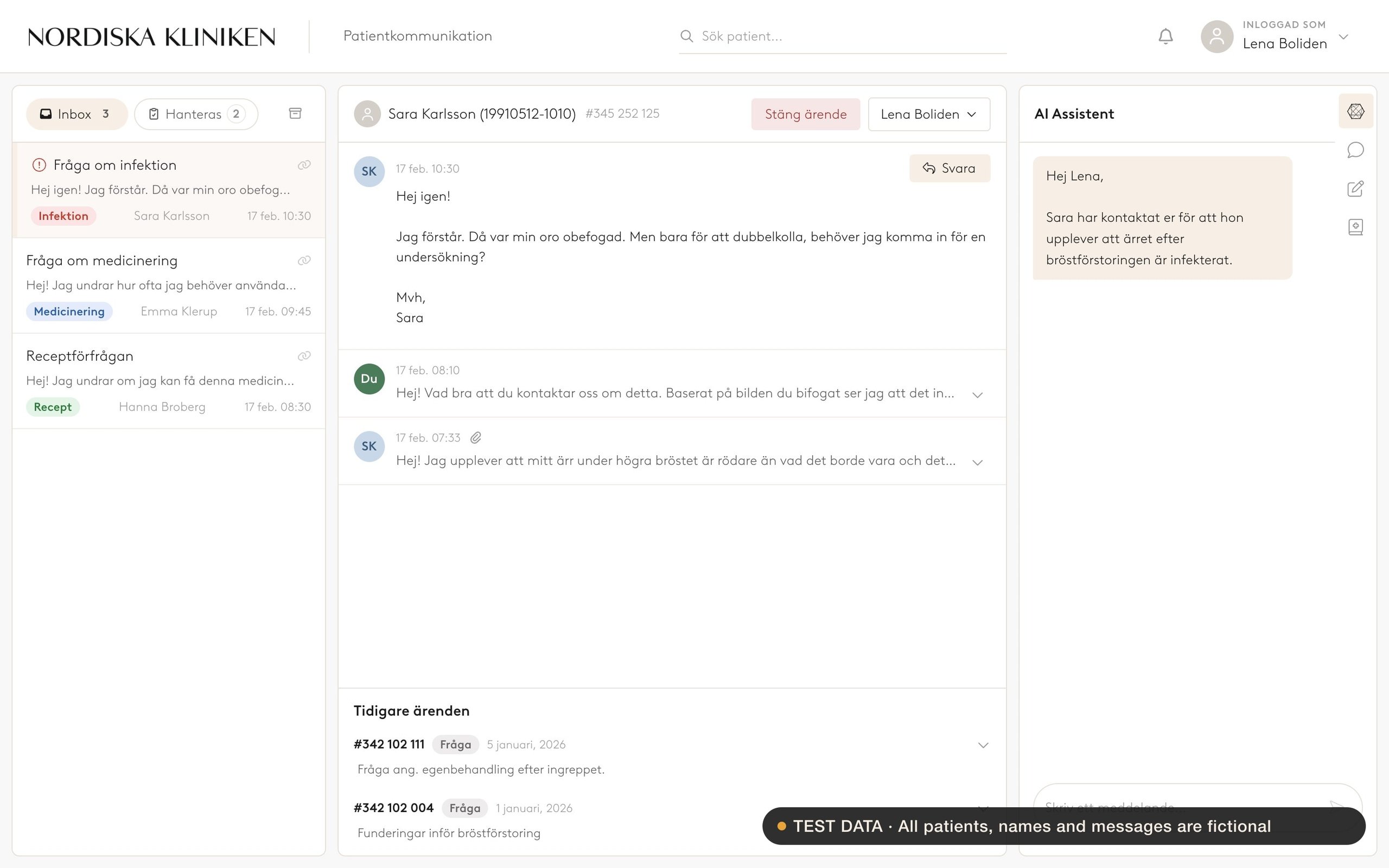
Cases on the left, the conversation in the middle, the AI assistant and internal tools on the right. It is built for the clinic's desktops. Every name and message shown is test data.
The shared inbox, with fictional test patients
On the web
Live on the web
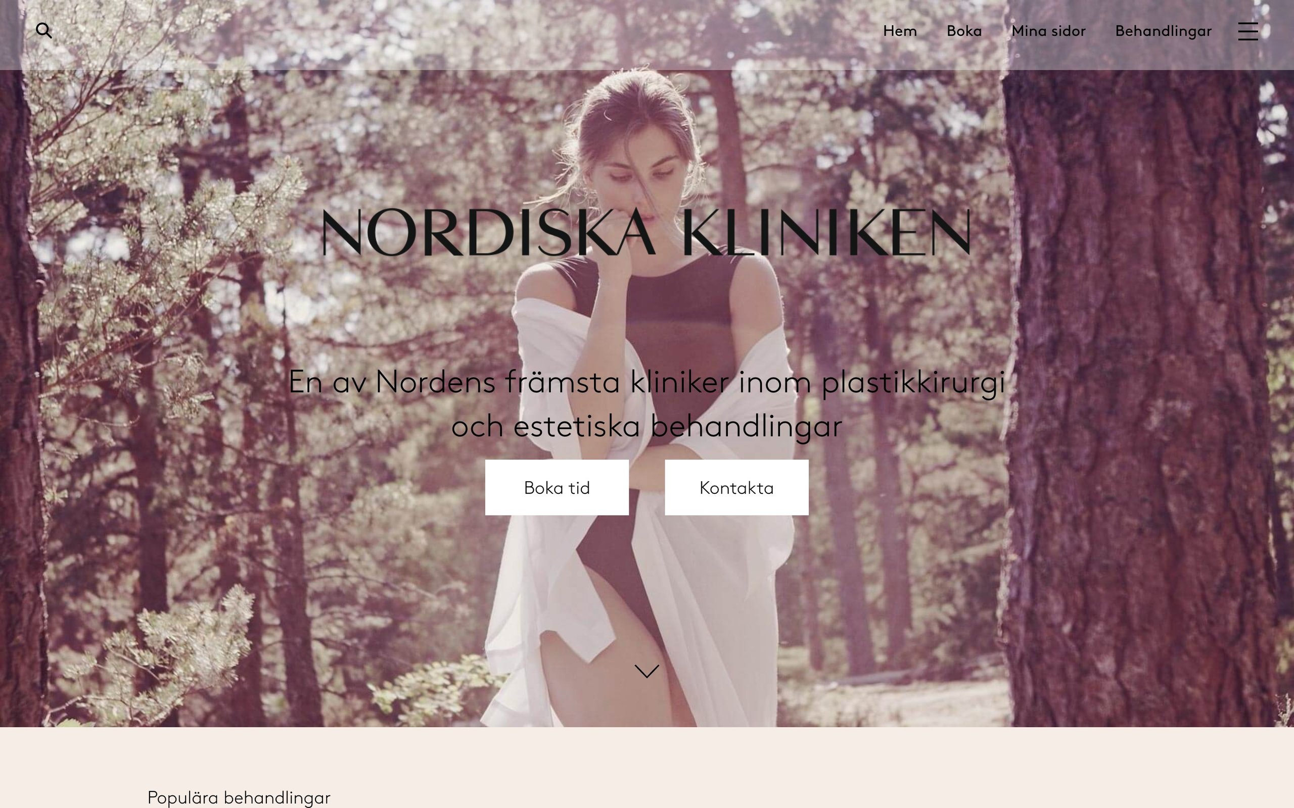
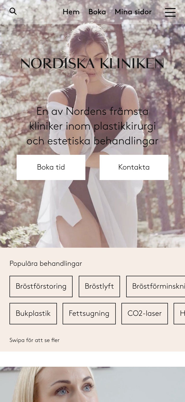
The clinic's public website, for context. The patient inbox itself is an internal tool with no public page.
Visit nordiskakliniken.seDesign system
The system
Warm neutrals taken from the clinic's brand, with colour saved for status and urgency.
Brown
The clinic's typeface, used for everything
- Soft tags in red, blue, green and grey, with red only for urgent clinical signs
- Short ease-out motion when a draft opens or a message is sent
- Font Awesome icons throughout
Outcome
Where it landed
The design became the clinic's patient communication platform, built out for production by Niklas and Dante. The reception inbox was built and tested in November 2026; going live was waiting on setup on the clinic's side.