Tabee
Swedish accounting firms lose hours every month chasing clients for missing receipts and invoices, the rows on the "OBS list". Tabee fetches them from mail, SaaS accounts and supplier portals and uploads them to Fortnox or Visma. I designed and built the marketing site, and made the product's value visible before anyone reads a word.
- Role
- Design · Build
- Platforms
- Web
- Team
- Solo on the site, within Techtify
- Made at
- Techtify Labs · in-house product
- Disciplines
- UI/UX · Motion · Front-end · Brand
- Online
- tabee.se
Context
An accounting firm's OBS list is the pile of bank transactions with no document behind them. The receipt is sitting in someone's inbox or behind a supplier login, and the accountant can only ask the client, again. Tabee is a new kind of tool, so the site had to explain what it does in seconds.
Who it's for
Swedish accounting firms on Fortnox or Visma, and smaller companies without a firm, who are careful about anything that touches their clients' accounts.
Constraints
- 01In Swedish, for accountants: plain words, their own terms, no startup hype.
- 02Trust before features: consent, review mode and the right to disconnect had to be as visible as the product.
- 03A usage-based price, which is easy to misread as unpredictable.
My role
I designed and built the site in a week: information architecture, copy structure, the visual system, the animated product visuals, the pricing page and the lead and pilot forms.
- Page structure for firms, companies, security and pricing
- The animated hero and the pricing flow
- A time-savings calculator
- Visual system and responsive layouts
- Lead and pilot application forms with email notifications
Key decisions
The calls that shaped it
Motion that explains the product
- Problem
- "We find missing documents and upload them" is abstract. A static screenshot of a dashboard nobody has used yet doesn't help either.
- Decision
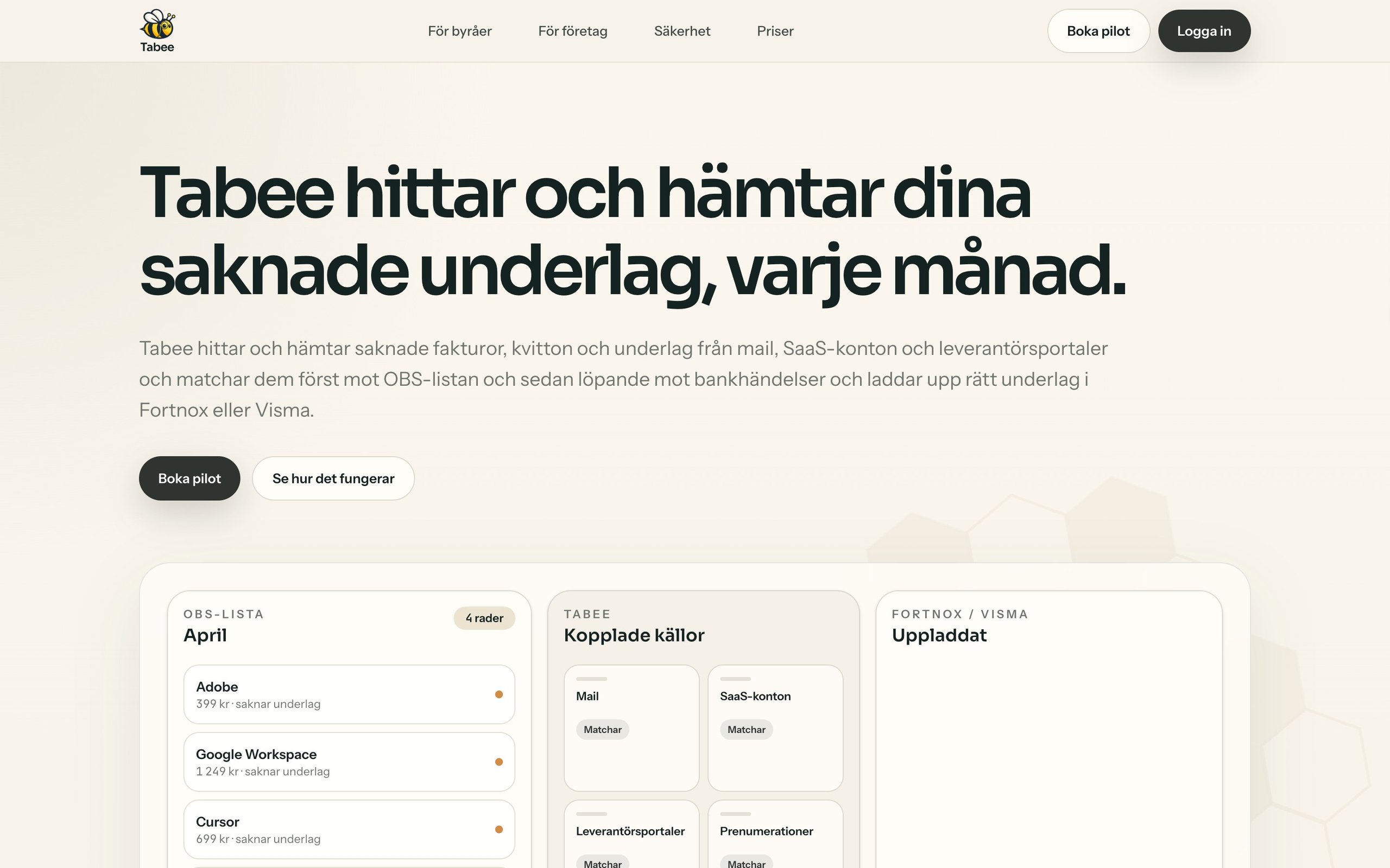
- The hero plays the product's job as a loop in three columns. A month's OBS list fills row by row. The sources appear: mail, SaaS accounts, supplier portals, subscriptions. Then a small bee flies from each source to its row, and the last column fills with uploaded PDFs. The flight paths are measured from the real layout, so they hold at every screen size.
- Why
- In one loop of about 13 seconds a visitor sees the before, the work and the after, in the order it happens. The bee ties it to the brand without needing a mascot section.
Pricing you can see
- Problem
- The price has a variable part, a small fee per document. Usage-based pricing makes careful buyers nervous: what if it runs away?
- Decision
- Above the price cards, the same bee travels three steps: Tabee finds the document, matches it, uploads it. The copy under the last step says it only counts once the document is found and uploaded. The home page has a calculator where a firm enters its own client count and minutes per document and sees the hours saved.
- Why
- It moves the question from "what will this cost?" to "I only pay when it worked". Showing the moment that's billed answers that better than a footnote.
Responsive
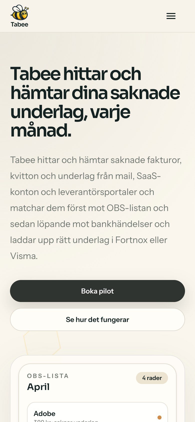
The site, at every width
Warm paper tones, one dark accent and a product visual that does the explaining. Built mobile-first, since accountants check links on their phones between clients.
The hero shows the OBS list filling itself, instead of describing it. · 1440 px
Design system
The system
Warm paper and a dark, calm green-black, like a well-kept ledger. The honeycomb pattern and the bee carry the brand.
Sora
Headlines
Instrument Sans
Body and interface
"Tabee Digits" (JetBrains Mono, digits only)
Every number on the site
- "Tabee Digits" is a font face that only covers 0–9. Placed first in every font stack, it makes every number monospaced, so amounts and counts line up, while letters stay in Sora and Instrument Sans.
- An earlier palette used a deep green accent (#0F5B4F). The final one is a calmer near-black, closer to the logo's dark outline.
- Reduced motion shortens CSS animations and transitions to almost nothing
Outcome
Where it landed
The site went from an empty Next.js app to a full marketing site with pricing, security pages and working lead and pilot forms in one week. It's built to recruit the first pilot firms: pick three to five clients with recurring OBS rows and measure how much of the list Tabee clears.